 Visual Paradigm Desktop |
  Visual Paradigm Online
Tips & Tricks
Want to make the most of our Online Image Translator? Explore the tips below to optimize your experience and get seamless translations every time!
After translating an image, some text elements may appear split into multiple segments, disrupting the natural flow of the content. This issue occurs when the AI detects a single phrase or sentence as separate blocks, leading to inconsistent formatting and misalignment. As a result, the translated text may look fragmented, affecting readability and the overall design.
For example, a title or a sentence might be broken into multiple small text blocks, making it difficult to adjust and reposition properly. This not only impacts the visual balance but also creates unnecessary effort when fine-tuning the layout.
The Merge Split Text feature in Visual Paradigm Online ‘s AI Image Translator allows users to combine multiple separated text blocks into a single unit, ensuring a structured and cohesive layout. By selecting the split text blocks and merging them, users can restore the proper sentence structure while maintaining text clarity and alignment. This feature helps streamline adjustments, making it easier to reposition, resize, and format the text as needed.
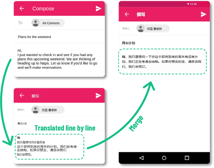
Select the split text blocks in the mail.
Press Merge blocks on top.
Unify the text font in the same category with Set as same size.
Align the text blocks with Align selected blocks to left.
For text under the icons, as they have various length, align the text to middle is a good choice.
Bold the page title and email title.
When different text blocks have varying sizes, the design can appear unbalanced. Use the “Set to Same Size” function to unify text elements within the same section or category. For example, body text should maintain a uniform size for readability, while titles or headers can be slightly larger to stand out. This ensures a well-structured and professional layout.
The right font style and color help your translated text blend naturally with the image. Choose a font that complements the original design—whether it is a formal document, a creative poster, or an infographic. Additionally, adjusting the font color can enhance visibility. For example, use darker shades for light backgrounds and lighter text for dark backgrounds to improve contrast and readability.
After merging split text, some blocks may not align perfectly with other elements. Manually repositioning them ensures that the translated content follows the original layout. This is particularly important for structured designs, such as diagrams, charts, or labels, where misalignment could confuse the reader.
By applying these simple adjustments, you can create a polished translation that maintains both readability and design integrity.
Experience the ease of translating text in images with our cutting-edge AI technology. Start using this Beta feature now and see how it transforms the way you communicate across languages.
